Usage Timelines and Comparisons
Usage information can also be displayed in an interactive Flash-based timeline. Commands in the upper left corner enable zooming in to different time periods, and you can click and drag the graph left and right to control the dates for which data are being displayed.
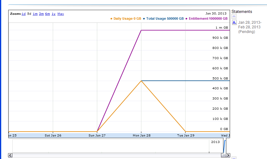
Interactive usage timeline
A similar interactive option is the Compare Meters graph, which simultaneously displays multiple features’ usage information over the same period of time.