Usage Gauges
This type of graph shows usage data as a graphical gauge representing the percentage of usage compared to the overall entitled amount. The green region of the gauge indicates usage of none to 75 percent of the available count; the yellow region indicates 75 percent to 100 percent of the available count; and the red region indicates over 100 percent (overage) of the entitled amount.
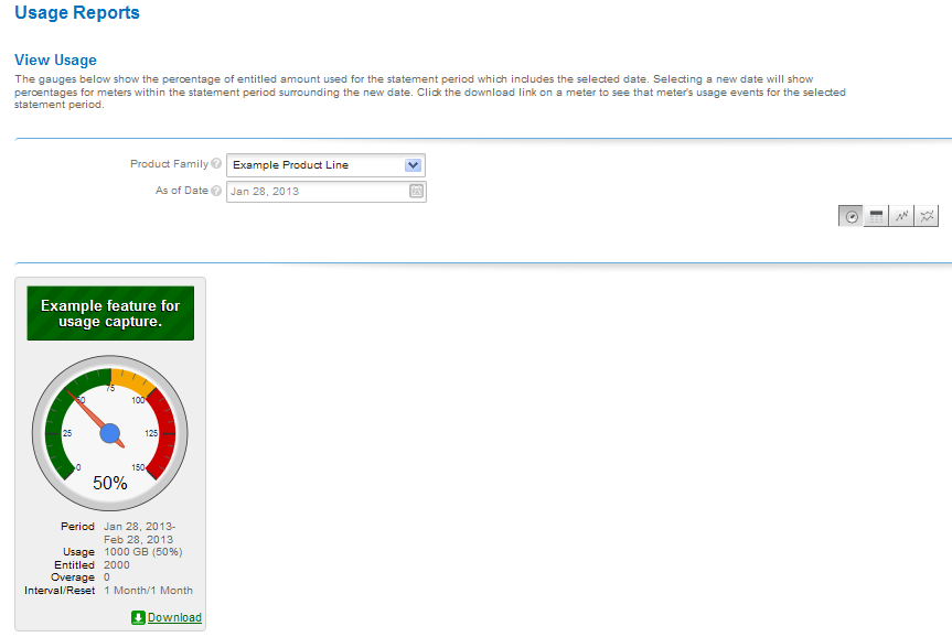
Usage gauge
Details of the usage information are displayed beneath the gauge.